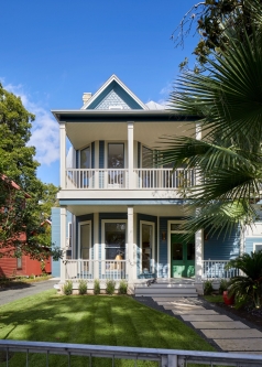
The existing house had been broken up into apartments years before and was not in great shape. There were additions from the 80s to the house on the side and back that were nicely done but oriented back inward towards the house as at the time they were done the now beautiful river was probably a ditch of sorts. The site was also almost entirely covered with concrete painted green – now flaking away – with openings here and there for plantings.
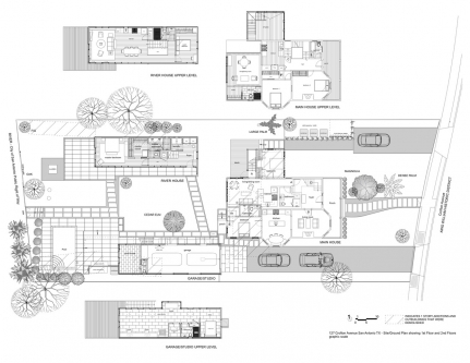
The program was mostly defined from the outset of the project. The existing house was to have homes for their older daughter and her grandmother and to have two new outbuildings: one that contained the garage and a glass studio and the other the “River House” that the clients would live in.
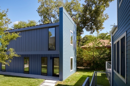
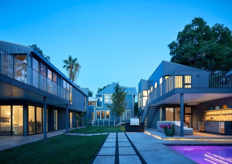
A courtyard approach was adopted: the two bars of the new buildings and the addition on the back of the existing house forming three sides of a courtyard overlooking the river. The two new structures were shifted in relation to one another creating a more dynamic relationship between them and also responding more directly to the angled geometry of the river on the Western end of the site.
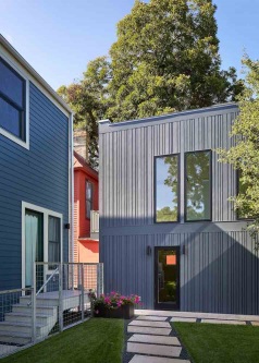
New additions to the original house, the two-story “tower” on the north side and the two-story addition on the river side, are detailed to match the original house. This is also true of the facades on the neighborhood side of the new structures that match the color, scale and character of the existing house and neighborhood. These facades also shield the sloped roofs and the solar panels that populate them from the street.
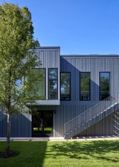
The glass studio and living areas are on the upper floors of their respective structures to take advantage of the long views along and across the river. Both of these second floor spaces are open, loft-like areas with strategically located skylights and with the slope of the roof apparent from the interior.
Randomly spaced “reverse board and batten” siding was developed for the two structures. The intent is to have a taut, flat surface irregularly interrupted to create a finer scale (that might typically be done in a non-modern design with casings and shingles) in a non-traditional way. The steel railings both inside and out of the new structures have a subtle random staggering of the depth of the vertical elements in plan that keep the regular 4 inch spacing of the balusters but obliquely have the feel of the random pattern on the siding.
In the design for the landscaping local Lueders stone pavers were used extensively – both as tight-jointed surface patios and set in grass as large stepping stones between the three buildings on the courtyard. A lot of (mostly unseen) effort was put into the grading, paving and edging in order for the relatively flat site to drain properly. Existing trees were saved where possible and new trees and bushes have been planted across the entire site to either direct or protect views.
